Data Visualization
Seaborn
4 min readAug 14, 2020
✔️ Having identical statistics doesn’t mean the individual data sets are all equal!!

Visualizing data by types: Numeric x Numeric

Visualizing data by types: Numeric x Categorical

import seaborn as sns# example datasets are given by seaborn. Imported datasets can be used just the same as we used earlier with pandas.raw = sns.load_datatset('tips')

Seaborn Basic function structure
sns.scatterplot(data=dataframe, x='total_bill', y='tip', hue='sex')Data Distribution (Numeric vs. Numeric)
relplot(data=dataframe, x=<column>, y=<column>, hue=<column>, kind='scatter)- kind options: ‘scatter’(default), ‘line’
sns.relplot(data=raw, x='tip', y='total_bill')
jointplot(data = df, x = <coloumn>, y=<column>, kind = 'scatter)- kind options
❓ ‘scatter’(default): point
❓ ‘reg’: point + regression
❓ ‘kde’: cumulative distribution chart like map
sns.jointplot(data = raw, x = 'tip', y = 'total_bill')
sns.jointplot(data = raw, x = 'tip', y = 'total_bill', kind = 'kde')
sns.jointplot(data = raw, x = 'tip', y = 'total_bill', kind = 'regg')
sns.jointplot(data = raw, x = 'tip', y = 'total_bill', kind = 'hex')
Pairplot(data = df)
Visualize the relationship between each two column in the entire numeric data column in data frame
sns.pairplot(data = raw)
sns.pairplot(data = raw, hue = 'sex')
Data Distribution (Numeric vs. Categorical)
sns.boxplot(data = raw, x = 'day', y = 'tip)
The line in the box indicates where the datasets are heavily weighted and the dots above (could be placed at the bottom) indicates unusual data.
sns.boxplot(data = raw, x = 'day, y = 'tip', hue = 'smoker')
Boxplot does not show the individual value for each data so if the amount of data is low, we can not roughly estimate with boxplot.
sns.swarmplot(data = raw, x = 'day', y = 'tip')
sns.swarmplot(data = raw, x = 'day', y = 'tip', hue = 'smoker', dodge = True)
sns.barplot(data = raw, x = 'size', y = 'tip')
sns.barplot(data = raw, x = 'size', y = 'tip', hue = 'sex')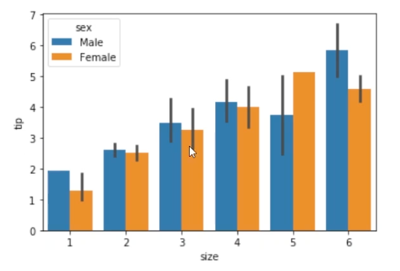
Data Distribution (Numeric vs. Categorical vs. Categorical)
If using heatmap, we can see the entire two categorical data distribution of numerical data value all in one by using color.
df = raw.pivot_table(index = 'day', columns = 'size', values = 'tip', aggfunc = 'mean')
sns.heatmap(data = df)
sns.heatmap(data = df, annot = True)
sns.heatmap(data = df, annot = True, fmt = '.2f')
sns.heatmap(data = df, annot = True, fmt = '.2f', cmap = 'Blues')
- fmt options: ‘.1f’, ‘.2f’, ‘.3f’ …
- cmap options: Reds, Blues, vlag, Pastel1